House Numbers & Chinoiserie
The style of common American house numbers was influenced by Chinese design.
There is a fairly ubiquitous design style to the address numbers on American houses. While there are some variations to the design it’s essentially a brush script typeface.
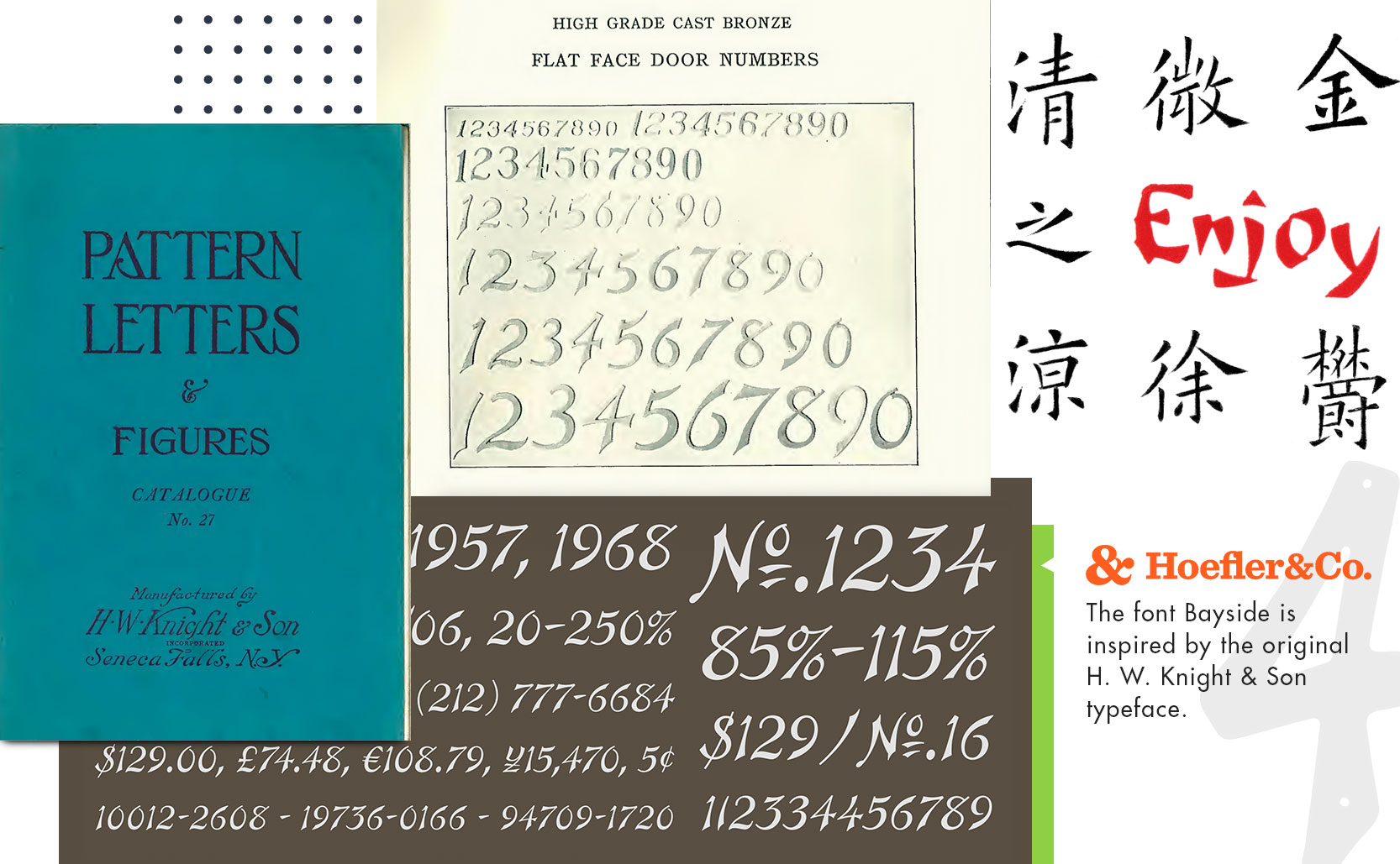
The earliest example of this typeface is the 1927 H. W. Knight & Son catalog of letters & numbers, a catalog of physical type to be used in signage, monuments, headstones, etc. Described as simply “Door Numbers” with no comment on the design, the catalog offers two different styles of numbers with the other being more of a traditional serif typeface. It’s the brush script set of numbers though that we see most frequently, but why?

Chinoiserie
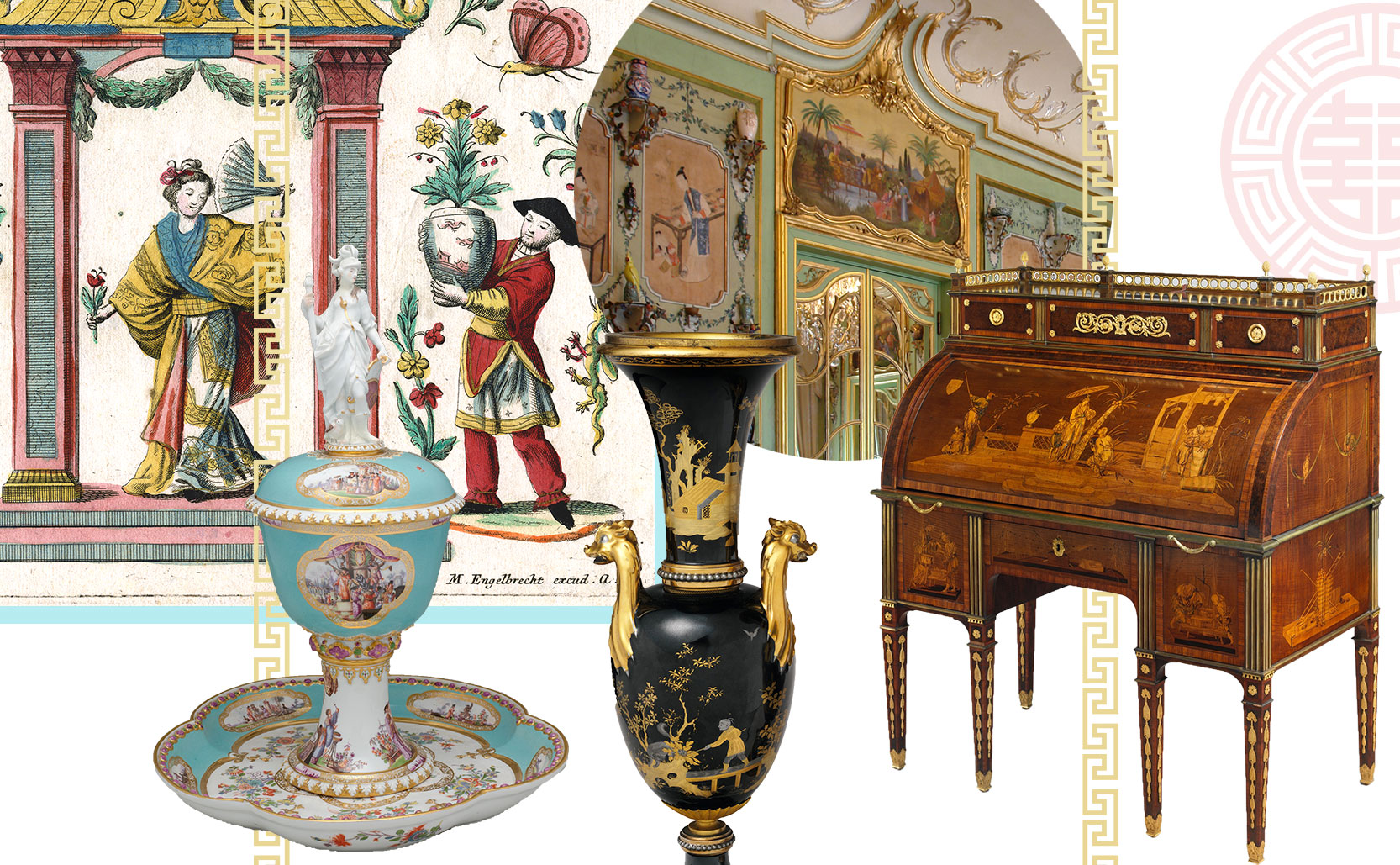
From the late 17th through the 18th century there was a European fascination with things from the East and in particular China. Europeans emulated the Chinese decorative style and incorporated it into their own work. The Willow pattern for example is reminiscent of Qing dynasty but was created in England.
“Chinoiserie” is essentially French for “Chinese style” and came to encapsulate this orientalist movement of European produced creations designed in a (sometimes loose interpretation of) Chinese style. In the 19th century there was a Chinoiserie revival which lasted into the 1920s. The Art Deco movement was strongly influenced by designs from China (just look at Grauman’s Chinese Theatre). Which brings us back to H. W. Knight & Son in 1927.


The design of the H.W. Knight house numbers was influenced by the Art Deco Chinoiserie style of the day. Looking at traditional Chinese calligraphy as well as more modern Chinese inspired fonts it’s easy to draw a connection between these house numbers and Chinese designs. In 2006 Hoefler&Co. created the font Bayside which is a new font inspired by the H. W. Knight & Son typeface.


