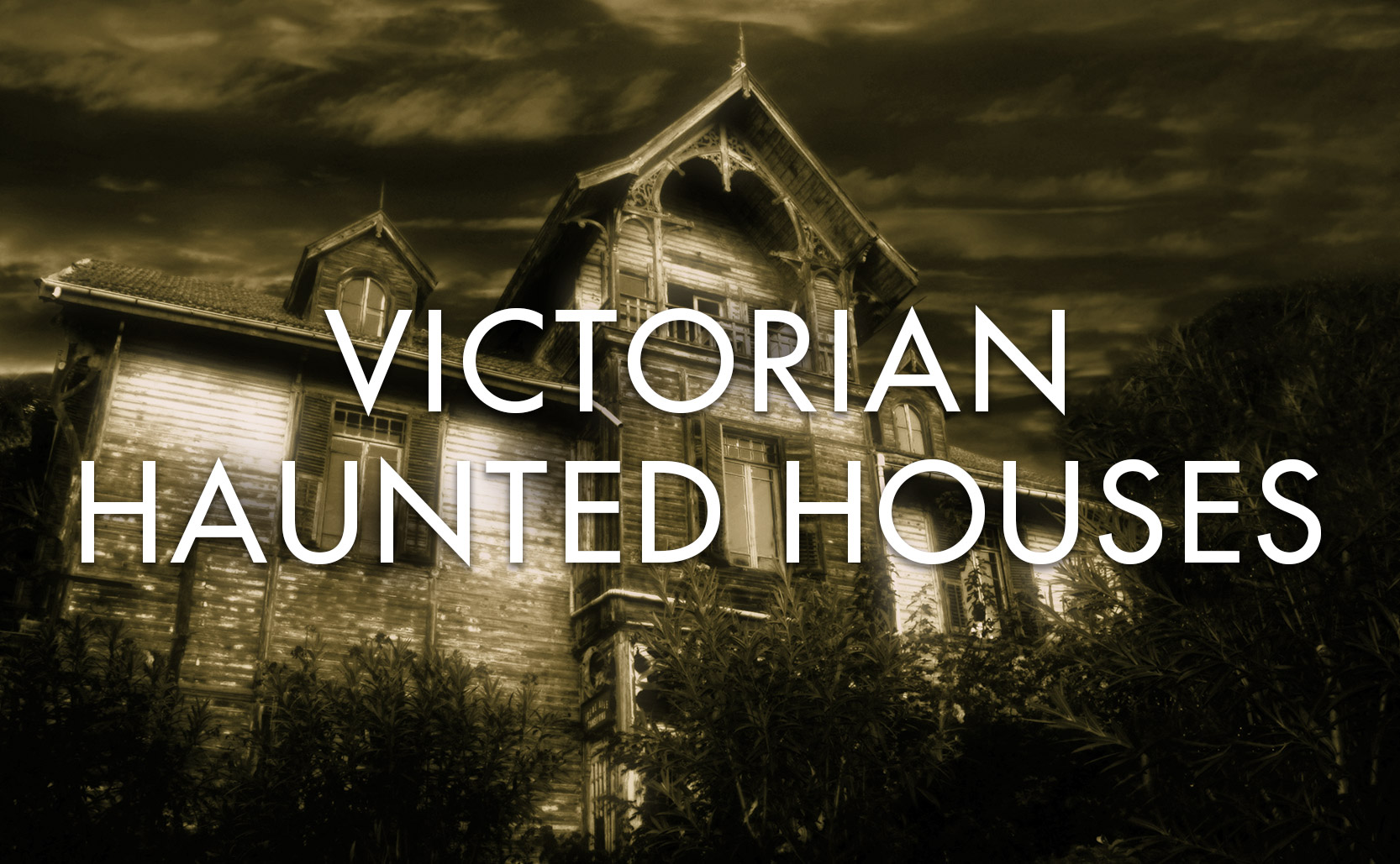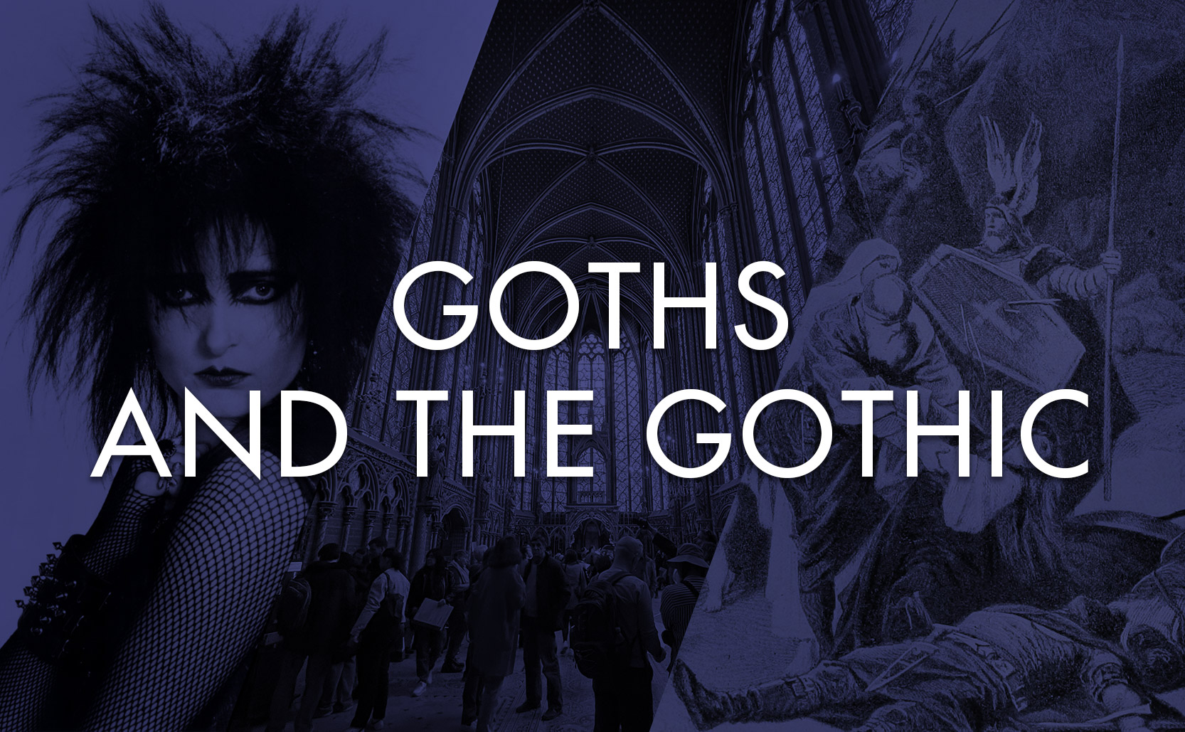
Goths and the Gothic
Long before Goths were dressing in all black they were Germanic warriors who brought about the Dark Ages.
The original Goths were a host of 4th century Germanic tribes. As the Huns invaded from the east some Goths joined the Huns (later becoming the Ostrogoths) while others moved west invading areas controlled by the Romans. As the Roman empire split in two becoming the Eastern Roman Empire and the Western Roman Empire, some Goths joined the Romans while others remained independent.
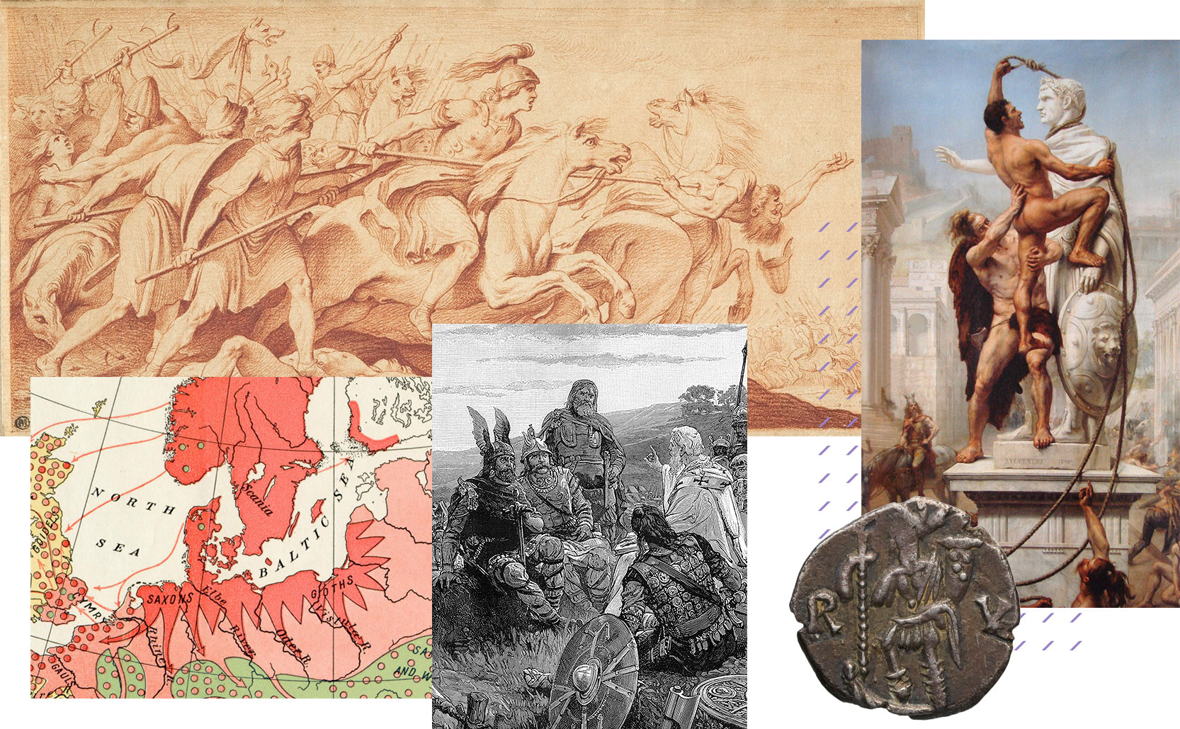
On September 4th, 476 CE the Goth warrior Odoacer led an invasion of Rome and successfully deposed the 16 year old Roman Emperor Romulus Augustulus. In so doing he brought about the end of the Western Roman Empire, an end of Roman control, and the beginning of the Dark Ages.
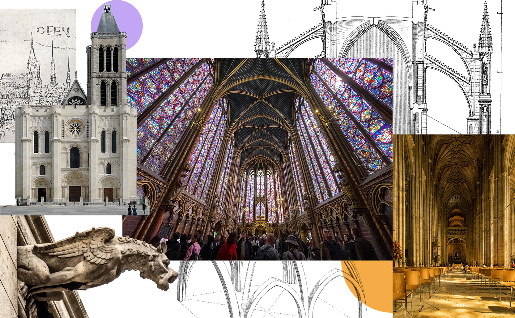
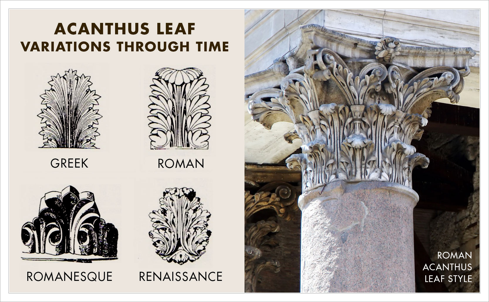
Gothic architecture
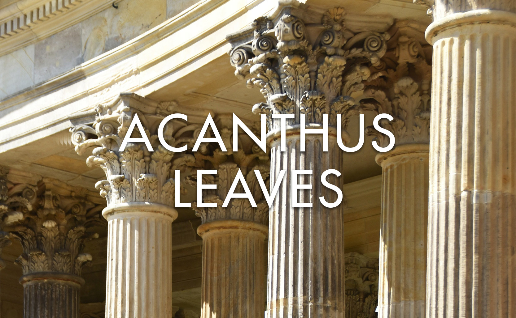
With the fall of the Western Roman Empire the continent fractured into various local powers. This change in power also led to a change in culture, turning away from Roman influence. Out of this came (what we call today) Gothic architecture. This new style featured pointed arches (instead of the rounded Roman style), flying buttresses, rib vault ceilings, stained glass, tall pointed spires, and more.
In actuality the Goths had nothing to do with Gothic architecture. The name was applied later as an insult by Renaissance painter & architect Giorgio Vasari. The Renaissance swung the cultural pendulum back towards all things Roman and Vasari applied “Gothic” to the interregnum medieval style that had turned away from the Rome. He blamed the Goths for the destruction of Rome (and Roman culture) and so “Gothic” was his name for this non-Roman architectural style. Perhaps if Vasari had been less biased he would have credited the Middle Eastern / Islamic architectural influence more and named the style accordingly.
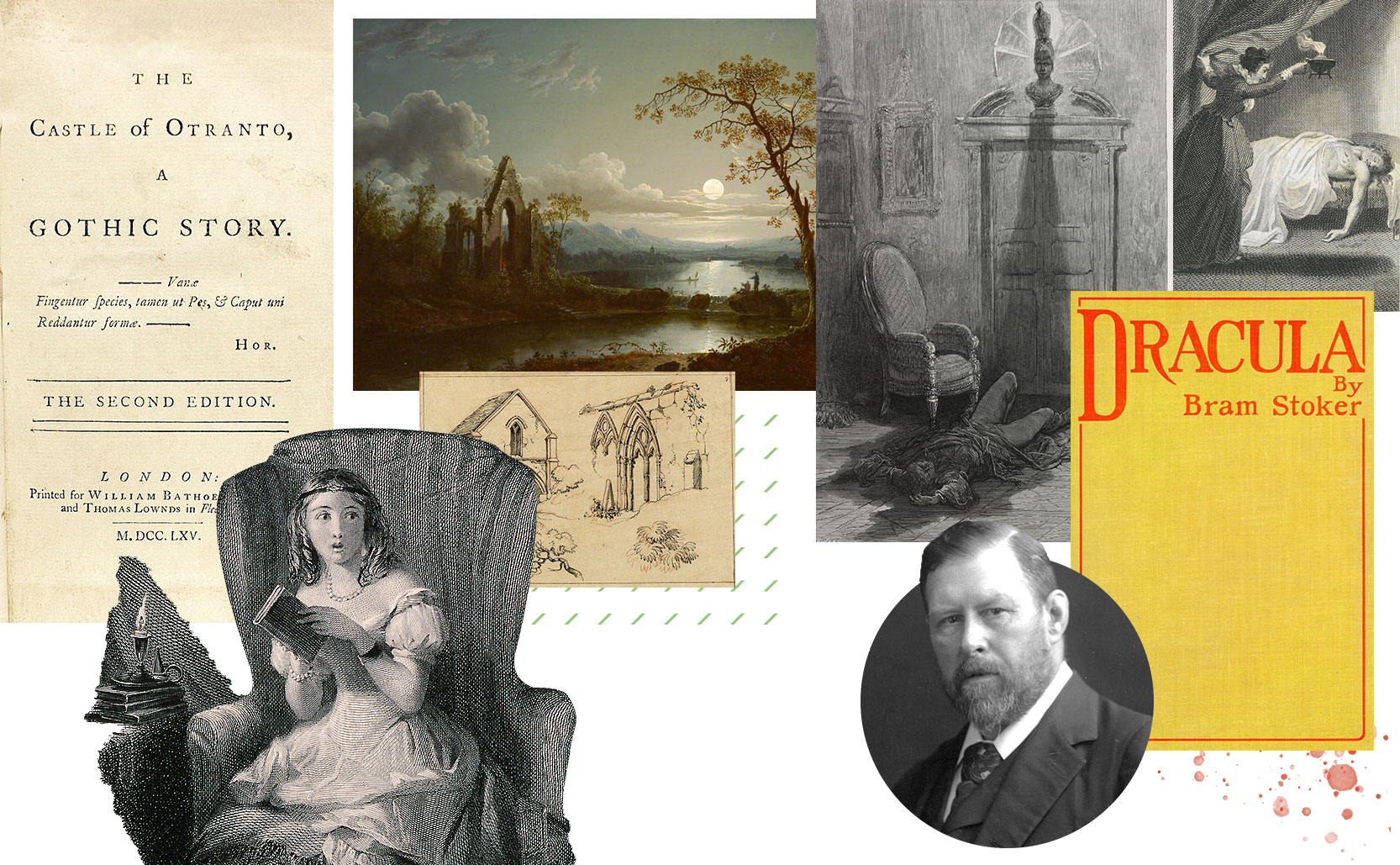
Gothic literature
Fast forward to the 18th century and the Goths appear again (or their name at least). Gothic fiction grew out of Romanticism which was broadly emotional with a spiritual reverence for nature. Gothic fiction took that but focused on the supernatural and darker feelings – fear & loathing if you will.
The Castle of Otranto by Horace Walpole is considered the first gothic novel. Published in 1764 it features a family in a haunted castle, an ancient prophecy, death, and sorrow. These elements are typical of Gothic fiction which by the Victorian era included literary classics such as 1818’s Frankenstein, 1845’s The Raven, 1886’s Strange Case of Dr Jekyll and Mr Hyde, and 1897’s Dracula among others.
Gothic fiction got its name from Walpole whose The Castle of Otranto was subtitled “A Gothic Story”, in reference to Gothic architecture. Gothic stories were frequently set in spooky old Gothic castles & ruins. Simultaneously the Gothic Revival architectural movement brought Gothic architecture back into fashion – what’s old is new again.
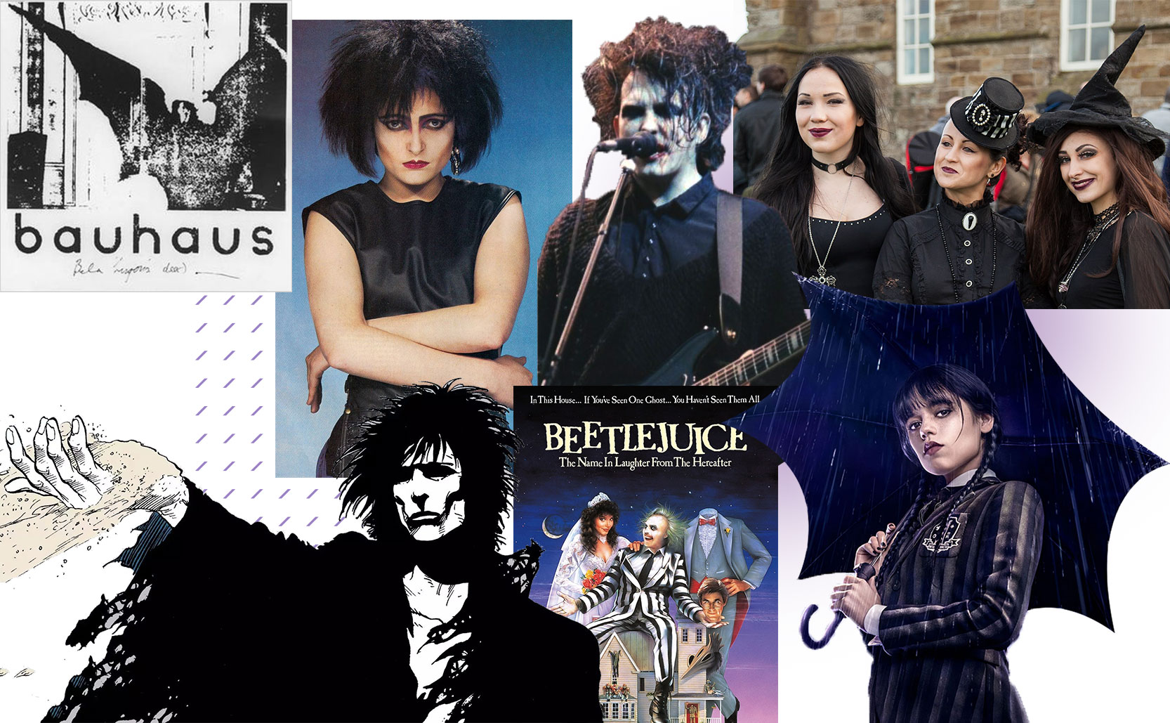
Gothic rock
Gothic fiction’s dark and brooding nature served as the foundation for today’s Goth culture. Gothic rock formed as a subgenre of late 1970s British post-punk music. It took the dark deathly themes of Gothic fiction and set them to minor key, dirgelike melodies. Joy Division, Siouxsie and the Banshees, Bauhaus, The Cure and others helped define the genre.
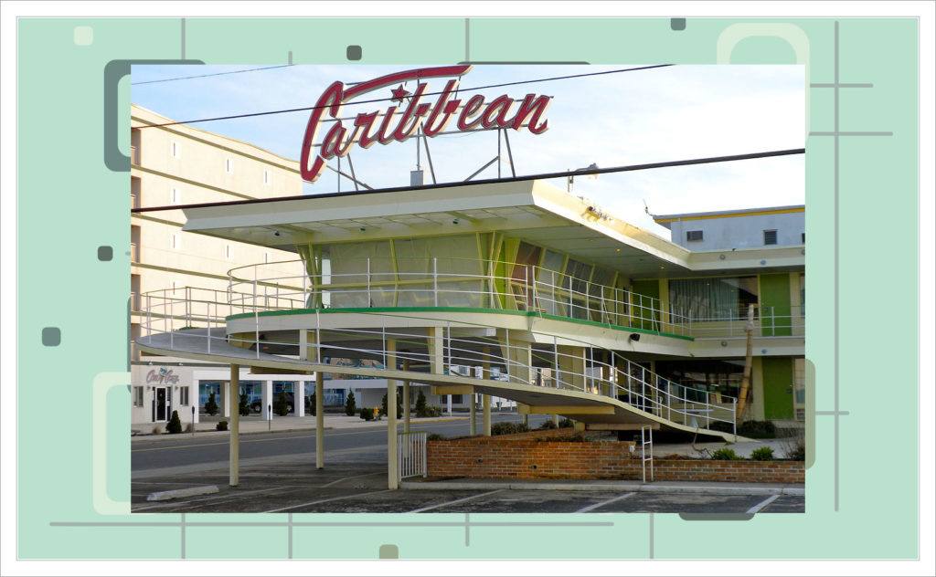
Gothic rock also led to Gothic fashion. While the many subgenres of Gothic rock each have their own subgenres of Gothic fashion, the prevailing vampiric style is dressing in black clothes, dyed black hair, pale skin, with some degree of androgyny. Beyond music & fashion Goth culture can be found in the 1983 vampire film The Hunger, Neil Gaiman’s The Sandman comic series, the 1994 film The Crow, and a host of projects by Tim Burton from Beetlejuice to Edward Scissorhands to Wednesday.
From the Goths, to Gothic, to Goths
So the Goths inadvertently lent their name to an architectural movement, a movement that became the name of a literary genre with sad spooky themes, which then became the basis of the dark & gloomy Goths of today. From the old Goths to the new Goths, they’ve helped push culture in new directions for millennia.
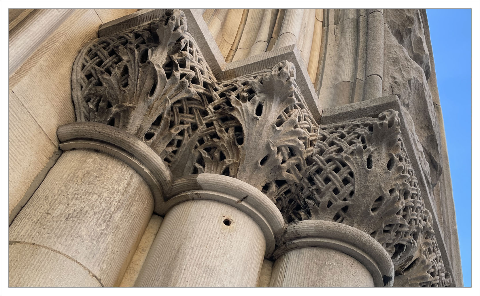
Added info: a fun element of Gothic architecture are gargoyles & grotesques. True gargoyles channel rain water off buildings as waterspouts. The name “gargoyle” coming from the French “gargouille” meaning “throat”. This also gets us the word “gargle” for the same reason. There is an associated mythology about a dragon named Gargouille that gave the architectural features their name.
Grotesques on the other hand do not channel water. They’re also stone creatures on Gothic buildings but they are pure ornamentation.