Trajan: the man, the column, the typeface
The Roman emperor Trajan’s military victories led to a triumphal column in his honor. The typography of the column led to a font also named in his honor.
Born in 53 CE in the modern day province of Seville Spain, Trajan was the second Roman emperor from the Nerva–Antonine dynasty (which produced the “Five Good Emperors” – including himself). His experience as a Roman general, senator, and governor of upper Germany helped him become emperor Nerva’s choice as his successor.
During his 19 year reign Trajan expanded the Roman Empire to its greatest size to date. As part of this expansion he took the kingdom of Dacia (roughly modern day Romania). One motivation for the conquest was that the Dacian kingdom, unlike other Germanic tribes, was sufficiently organized enough to make alliances with other nations, making it a threat to the Romans. Another motivation was money. After the conquest the Romans took control of the gold and salt mines of Dacia, using the proceeds to pay for public works projects back in Rome.
To celebrate this lucrative victory over Dacia the Roman Senate had a column constructed in Trajan’s honor, which leads to …

Trajan’s Column
Completed during Trajan’s lifetime in 113 CE, Trajan’s Column is a 98 foot tall marble column that commemorates / propagandizes Rome’s victory in the Dacian Wars. With an estimated total weight of over 1,000 tons it’s an impressive feat of artistry and engineering. As it spirals upwards it features 2,662 figures (Trajan being 58 of them) and 155 scenes in relief that tell the story of the conquest. National Geographic has an interactive graphic that does an incredible job guiding you up the column but plaster cast recreations of the relief exist in several museums around the world as well.
The column is also a tower – there is a circular staircase inside that takes you to the top. The top of the column used to (logically) have a statue of Trajan, but the statue went missing sometime in the Middle Ages and today St. Peter stands atop the tower.
The column / tower is also a tomb. After Trajan died in 117 CE his ashes were buried in a chamber at the base of the column. The ashes of Trajan’s wife Plotina were added a few years later. On the exterior of the base above the doorway to the burial chamber is an inscription to Trajan. More interesting that what the inscription says is how it says it. The beautiful letter forms of the typography became inspiration for letter artists and designers, which leads to …

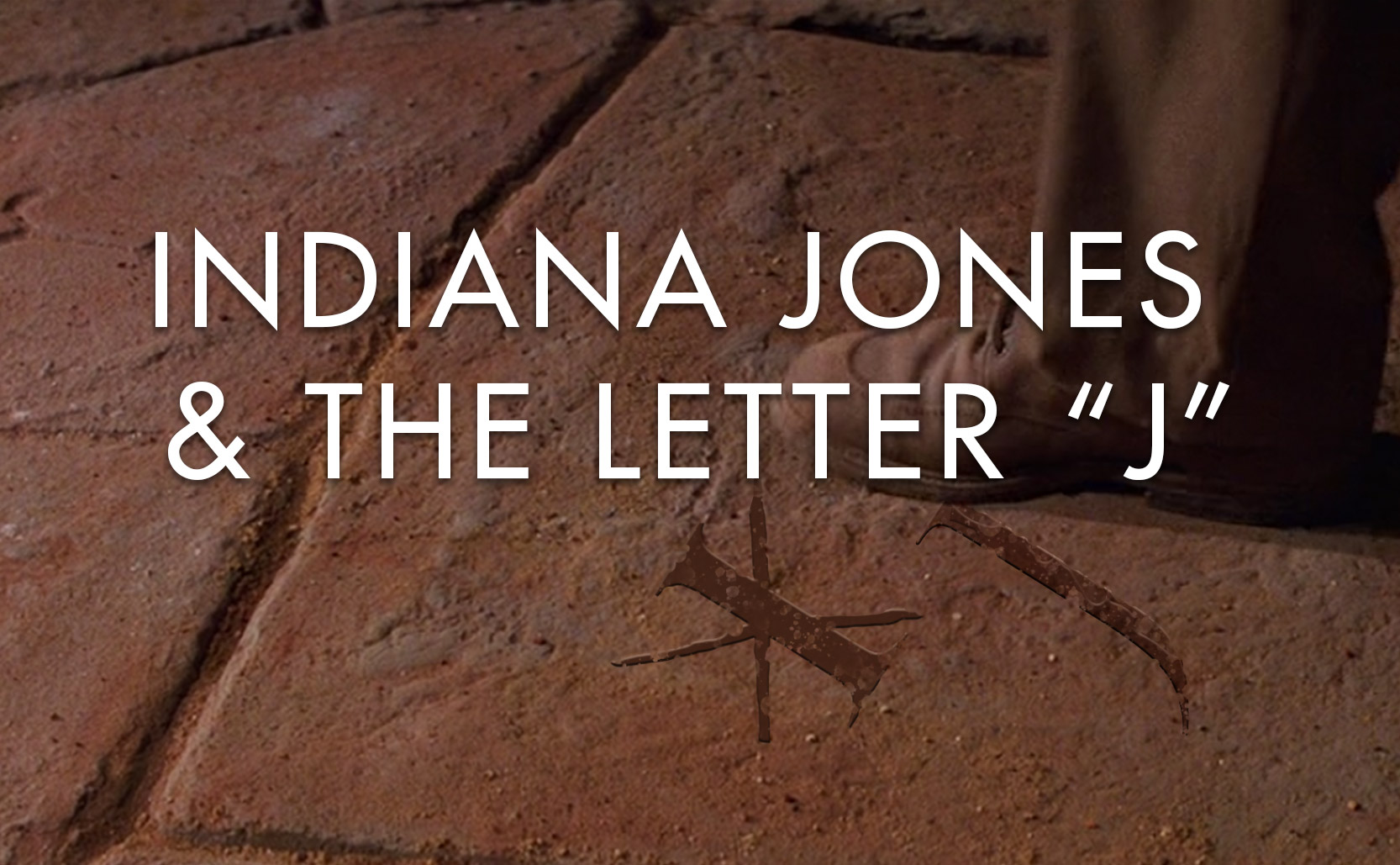
Trajan the Typeface
Trajan the typeface was created in 1989 by Carol Twombly for Adobe. She used the very old lettering on Trajan’s column as inspiration for a very new typeface. The letter forms found on Trajan’s column are known as Roman square capitals which are the basis for our uppercase letters. Roman square capital letters were used primarily for engravings and can be found around ancient Roman sites (the Pantheon, the Arch of Titus, etc).

From its debut in 1989 Trajan quickly became a very popular typeface and particularly for movies. Its first movie poster appearance was 1991’s At Play in the Fields of the Lord. In the early ‘90s it was thee typeface for dramatic films but spread to appearing across genres. Eventually the movie poster/packaging market was so saturated with Trajan that more serious films began to use other typefaces and so Trajan shifted to only really appearing in horror movies, B-movies, and straight-to-video movies. Trajan’s elegant letter forms were being employed to add gravitas to movies that might not be so great.
In less than a decade (less time than Trajan the man ruled the Roman Empire) Trajan the typeface rose and fell in popularity. You still see it from time to time – some new movies use Trajan, some politicians use it much like politicians did a few thousand years ago – but Trajan no longer rules like it once did in the 90s or the 1990s.