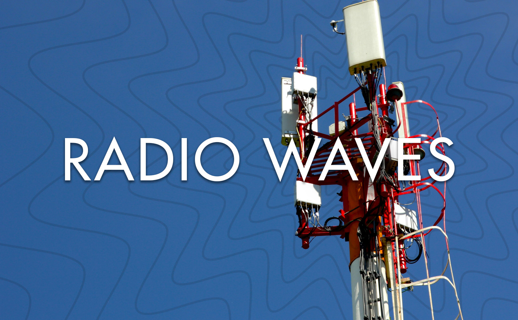
Radio Waves

From wireless telegraphs to 5G data, the modern world runs on radio waves.

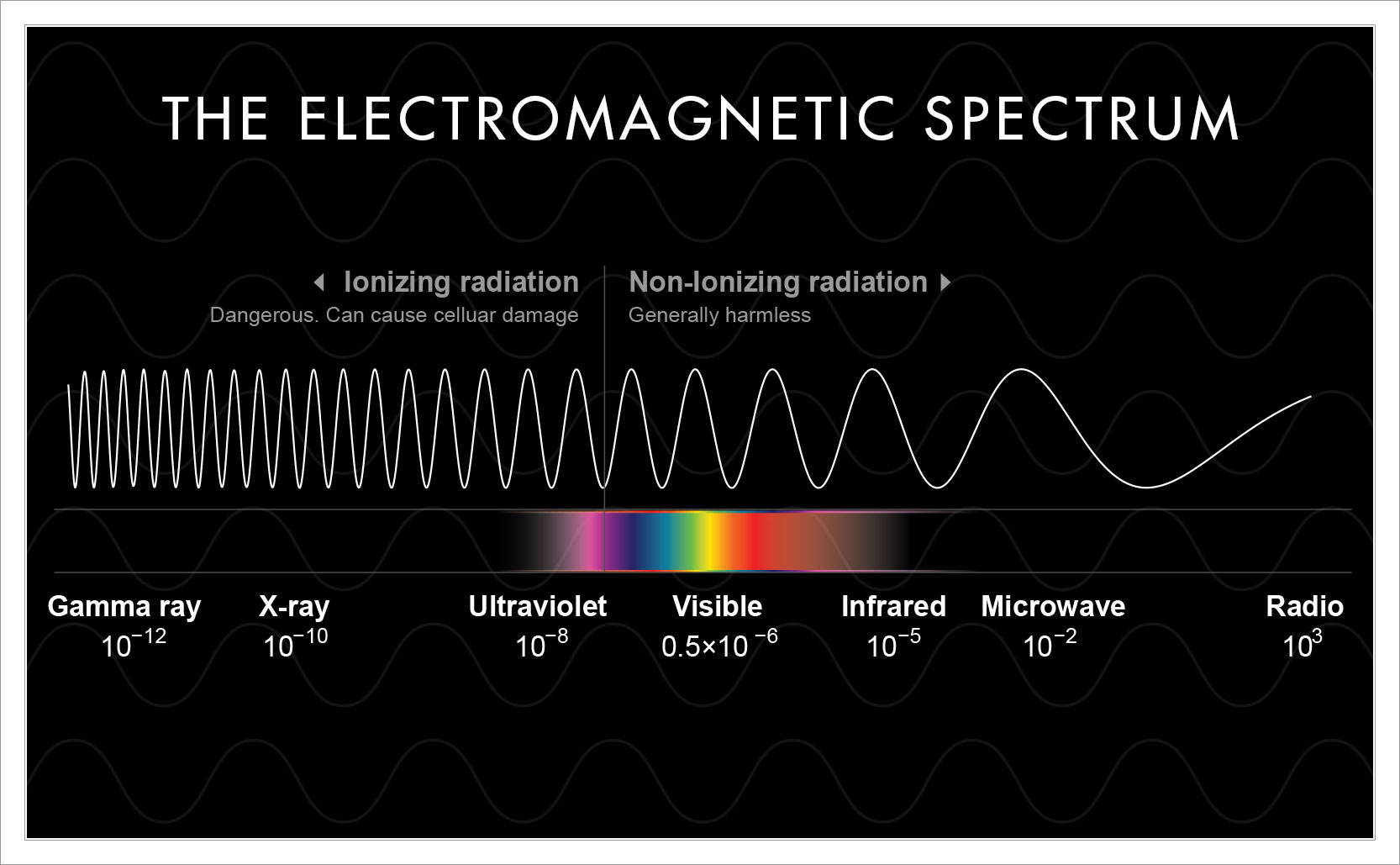
In the electromagnetic spectrum, radio waves are the lowest frequency & longest wave length waves available. The name “radio” doesn’t mean the waves are just for radios, it comes from the idea to “radiate energy” and the waves are used for lots of things. Wireless telegraphs, TV broadcasts, walkie talkies, radar, GPS, wireless routers, bluetooth, your mobile phone data – it’s all radio waves.

The existence of radio waves were proposed in 1867 by James Maxwell, but it took twenty years until 1887 for Heinrich Hertz to first demonstrate them (and because of this the hertz unit of measurement was named for him). The potential of radio waves was first realized by Guglielmo Marconi who used them to create wireless telegraphs. Marconi’s invention allowed people to send messages wirelessly through the air (which won him the 1909 Nobel Prize in physics). His invention is also one half of the very good Erik Larson book Thunderstruck.

Radio waves sit on the far end of the electromagnetic spectrum.

The Wave

We can send & receive data through the air thanks to transmitters & receivers. A transmitter antenna will send out a radio wave, modifying the wave form as need be. Then a receiver antenna will take the wave and process it as information. In the modern world most of that information is converted into binary ones & zeros as data.

Rather than sending out a consistent steady wave (which wouldn’t be very useful), transmitters modulate waves in various ways. You can modulate a wave’s amplitude as well as its frequency (which, incidentally, is why we have AM and FM radio – amplitude modulation and frequency modulation). You can also change where you begin & end a wave’s phase. This can create thousands of combinations, each of which can mean combinations of binary data. Using this complicated system of changing wave types we can have lots of devices sending & receiving information in relatively close proximity to one another. This is perhaps best demonstrated in the prolific use of mobile phones.

Cellular data (and the 5G boogeyman)

Mobile phones interact with antennas to send & receive data using radio waves. Each antenna covers a certain territory (a cell), but they are all working together (a network) – hence “cellular network”. Early mobile car phones had very few antenna to interact with so, once you left one’s area, you lost service. As mobile phones became popular in the 1990s more complex cellular networks with many towers were created.

5G is the fifth generation of the technology that runs these cellular networks. The challenge for 5G is to give even more devices even faster information. Part of how it does this is through an increase in the number of antennas. It also uses a wider range of wave frequencies. 5G uses radio waves but it also uses higher frequency microwaves (millimeter waves) to send more information, faster, across short distances. To do this the millimeter waves use smaller network cells, with more antennas, closer to the ground than the typical radio waves use.

As 5G was arrived out so too did the conspiracy theories.

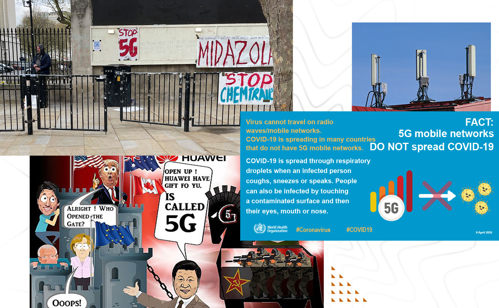
The rollout of 5G began in 2019 and with it came the conspiracy theories. Some people claimed 5G weakens our immune systems leaving us vulnerable to viruses (such as COVID-19). Others claimed Covid was caused by 5G waves or that the Covid vaccines contained secret microchips that would be controlled by 5G. There are also conspiracy theories that 5G causes cancer and specifically because of the millimeter microwaves. None of this is true.

The waves used in 5G are non-ionizing waves (meaning they do not remove electrons from atoms or damage human cells). Ionizing radiation is found on the other end of the electromagnetic spectrum beyond visible light. Ultraviolet, X-rays, and gamma rays will damage your cells, radio waves and microwaves do not. The waves used in 5G can’t penetrate your skin and no credible study has found them to be dangerous to humans. Alcoholic drinks and processed meats have higher likelihoods of causing cancer than 5G.

A really great explanation of how modern cellular networks operate.

A crash-course on 5G data.

John Snow’s Cholera Map

Through his medical investigation, Dr. John Snow helped solve how cholera is spread and created a legendary data visualization in the process.

With the Industrial Revolution, London’s population grew enormously. People from the countryside moved to the city for work and for a different life. London became the largest city on Earth. Between 1750 and 1850 it’s estimated that London’s population doubled, from around 1 million to around 2.3 million people. What grew with it was a civil engineering crisis in how to handle so many people in such close quarters. In short: what to do with the filth? By 1850 modern plumbing had not been extended to all parts of the city and specifically the Soho area. People had cesspools in their basements where they would empty their waste. In other places the sewage was emptied into the River Thames, which was also a source of drinking water.

London’s booming population growth in the early 19th century led to filthy conditions.

Modern germ theory states that microscopic organisms are responsible for the spread of disease. Before we understood this people believed in the miasma theory which claimed that disease was spread by “bad air”. For centuries people believed that epidemics were being spread by dirty air, they had no knowledge of microorganisms. It’s not entirely misguided. Things that smell bad can, in fact, have disease. So while “bad air” may be a warning sign that disease is present, it’s not necessarily the air itself that causes sickness. In mid-19th century London miasma theory was the prevailing scientific theory but some scientists were beginning to doubt its validity.

Dr. John Snow challenged the prevailing miasma theory of disease through research and data.

You Know Something John Snow

Cholera is spread through tainted water or food that has come into contact with fecal matter. Between 1846 to 1860 the world was in a cholera pandemic, and in 1854 there was an outbreak in the Soho district of London. Nobody knew exactly how cholera spread but Dr. John Snow had a theory that it wasn’t miasma. A few years earlier in 1849 he published On the Mode of Communication of Cholera where he laid out a theory that a germ (that had yet to be identified) was responsible for cholera. He believed that cholera was spread by “…the emptying of sewers into the drinking water of the community.” The 1854 outbreak in Soho gave him a chance to prove his theory.

In the first 7 days of the outbreak 10% of the neighborhood died. Like a medical detective Snow began investigating the addresses of the deaths. He spoke to residents of the area, he asked where they got their water from, he took down notes, he looked at the sources of water for that part of London. The thing that was truly groundbreaking was that he visualized his data. He drew a map of the area, he noted the locations of water sources, and he added black bars at the addresses where deaths had occurred.

A detail of Snow’s 1854 cholera map. The Broad Street pump is at the center as a circle, and the deaths per address are the stacked black bars. You can view the full map here.

Unlike a data table, a data visualization has the ability to quickly & easily show trends. With a glance you can see patterns or outliers. You can tell a visual story with numbers. As Snow’s visualization grew he could see that cholera deaths clustered by one water source in particular: the Broad Street pump. He was able to show that other addresses in the area, who had their own private water sources (such as a local workhouse and a brewery) were mostly spared. The workhouse had 18 deaths but all of those individuals had separately gone to drink water from the Broad Street pump. This helped disprove the miasma theory because all of the workers should have gotten sick by the same “bad air”, but they didn’t. He took his findings to the local authorities. They found that the Broad Street pump was near a cholera infected home whose cesspool was leaking into the surrounding soil and infecting the water supply. Authorities removed the handle to the pump and deaths decreased.

Snow’s cholera map helped create modern epidemiology. COVID-19 visualizations are directly influenced by Snow’s work.
Today the pump still stands (without the handle) and sits outside of a pub named for Snow. Inside they pub has a few framed items that tell some of this story.

the Visualization of Data

To say that John Snow’s cholera map is legendary is not an exaggeration. Anyone with a passing knowledge of data visualization knows about his map. Modern epidemiologists still talk about his work. Snow’s methodical approach to data collection & data visualization influenced public policy and helped London prepare for the next cholera outbreak. It helped disprove miasma theory and advanced the modern germ theory we still use today. His cholera map helped make John Snow the father of modern epidemiology.

You can see the evolution of Snow’s work in today’s COVID-19 reporting. Contact tracing, the mapping of infections, accounting for local public policies regarding masks, tracking superspreader events – it’s all influenced by Snow’s 1854 cholera map.

Added info: Today there is a replica of the water pump where the old one stood, but Broad Street is now called Broadwick Street. The pump sits just outside of the John Snow pub.

Playing off of the lead character Jon Snow’s name, a White Walker from Game of Thrones stood outside of the John Snow pub in Soho in 2014. Photo via reddit.