Through his medical investigation, Dr. John Snow helped solve how cholera is spread and created a legendary data visualization in the process.
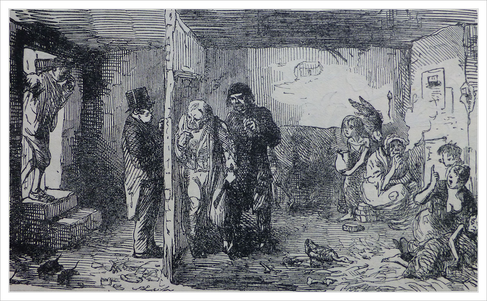
With the Industrial Revolution, London’s population grew enormously. People from the countryside moved to the city for work and for a different life. London became the largest city on Earth. Between 1750 and 1850 it’s estimated that London’s population doubled, from around 1 million to around 2.3 million people. What grew with it was a civil engineering crisis in how to handle so many people in such close quarters. In short: what to do with the filth? By 1850 modern plumbing had not been extended to all parts of the city and specifically the Soho area. People had cesspools in their basements where they would empty their waste. In other places the sewage was emptied into the River Thames, which was also a source of drinking water.
Modern germ theory states that microscopic organisms are responsible for the spread of disease. Before we understood this people believed in the miasma theory which claimed that disease was spread by “bad air”. For centuries people believed that epidemics were being spread by dirty air, they had no knowledge of microorganisms. It’s not entirely misguided. Things that smell bad can, in fact, have disease. So while “bad air” may be a warning sign that disease is present, it’s not necessarily the air itself that causes sickness. In mid-19th century London miasma theory was the prevailing scientific theory but some scientists were beginning to doubt its validity.
You Know Something John Snow
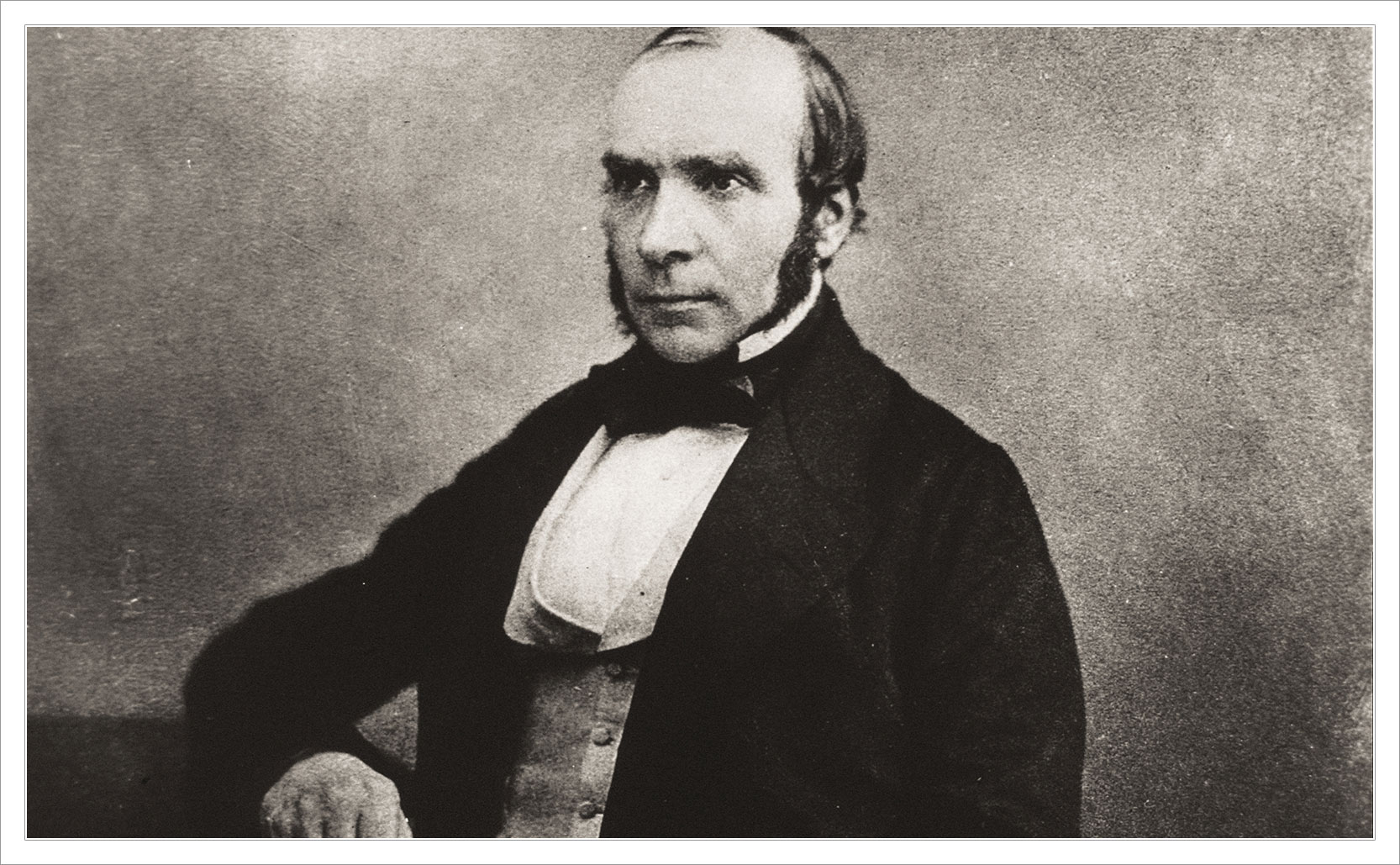
Cholera is spread through tainted water or food that has come into contact with fecal matter. Between 1846 to 1860 the world was in a cholera pandemic, and in 1854 there was an outbreak in the Soho district of London. Nobody knew exactly how cholera spread but Dr. John Snow had a theory that it wasn’t miasma. A few years earlier in 1849 he published On the Mode of Communication of Cholera where he laid out a theory that a germ (that had yet to be identified) was responsible for cholera. He believed that cholera was spread by “…the emptying of sewers into the drinking water of the community.” The 1854 outbreak in Soho gave him a chance to prove his theory.
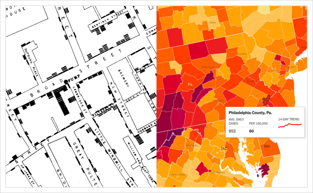
In the first 7 days of the outbreak 10% of the neighborhood died. Like a medical detective Snow began investigating the addresses of the deaths. He spoke to residents of the area, he asked where they got their water from, he took down notes, he looked at the sources of water for that part of London. The thing that was truly groundbreaking was that he visualized his data. He drew a map of the area, he noted the locations of water sources, and he added black bars at the addresses where deaths had occurred.
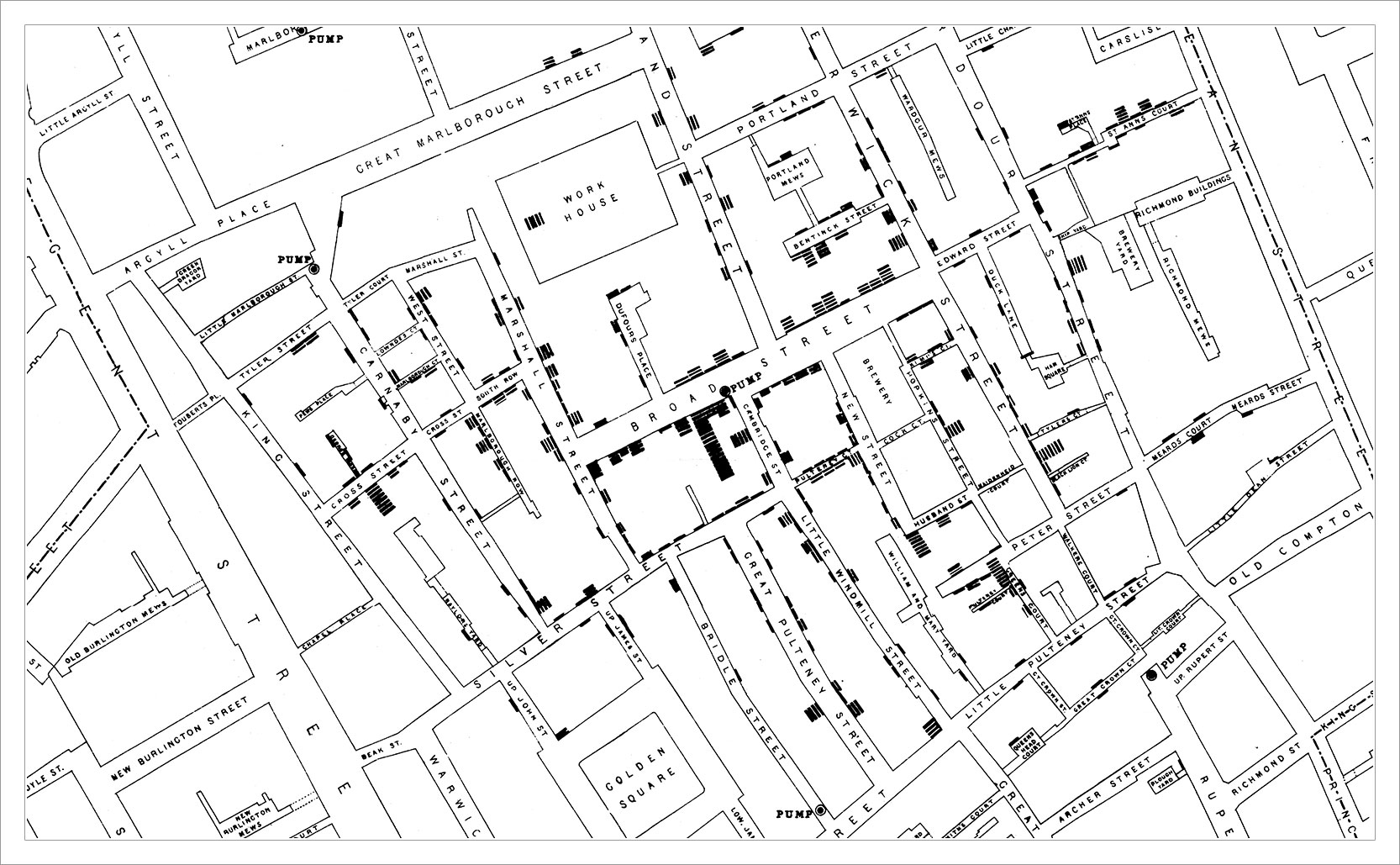
Unlike a data table, a data visualization has the ability to quickly & easily show trends. With a glance you can see patterns or outliers. You can tell a visual story with numbers. As Snow’s visualization grew he could see that cholera deaths clustered by one water source in particular: the Broad Street pump. He was able to show that other addresses in the area, who had their own private water sources (such as a local workhouse and a brewery) were mostly spared. The workhouse had 18 deaths but all of those individuals had separately gone to drink water from the Broad Street pump. This helped disprove the miasma theory because all of the workers should have gotten sick by the same “bad air”, but they didn’t. He took his findings to the local authorities. They found that the Broad Street pump was near a cholera infected home whose cesspool was leaking into the surrounding soil and infecting the water supply. Authorities removed the handle to the pump and deaths decreased.
the Visualization of Data
To say that John Snow’s cholera map is legendary is not an exaggeration. Anyone with a passing knowledge of data visualization knows about his map. Modern epidemiologists still talk about his work. Snow’s methodical approach to data collection & data visualization influenced public policy and helped London prepare for the next cholera outbreak. It helped disprove miasma theory and advanced the modern germ theory we still use today. His cholera map helped make John Snow the father of modern epidemiology.
You can see the evolution of Snow’s work in today’s COVID-19 reporting. Contact tracing, the mapping of infections, accounting for local public policies regarding masks, tracking superspreader events – it’s all influenced by Snow’s 1854 cholera map.
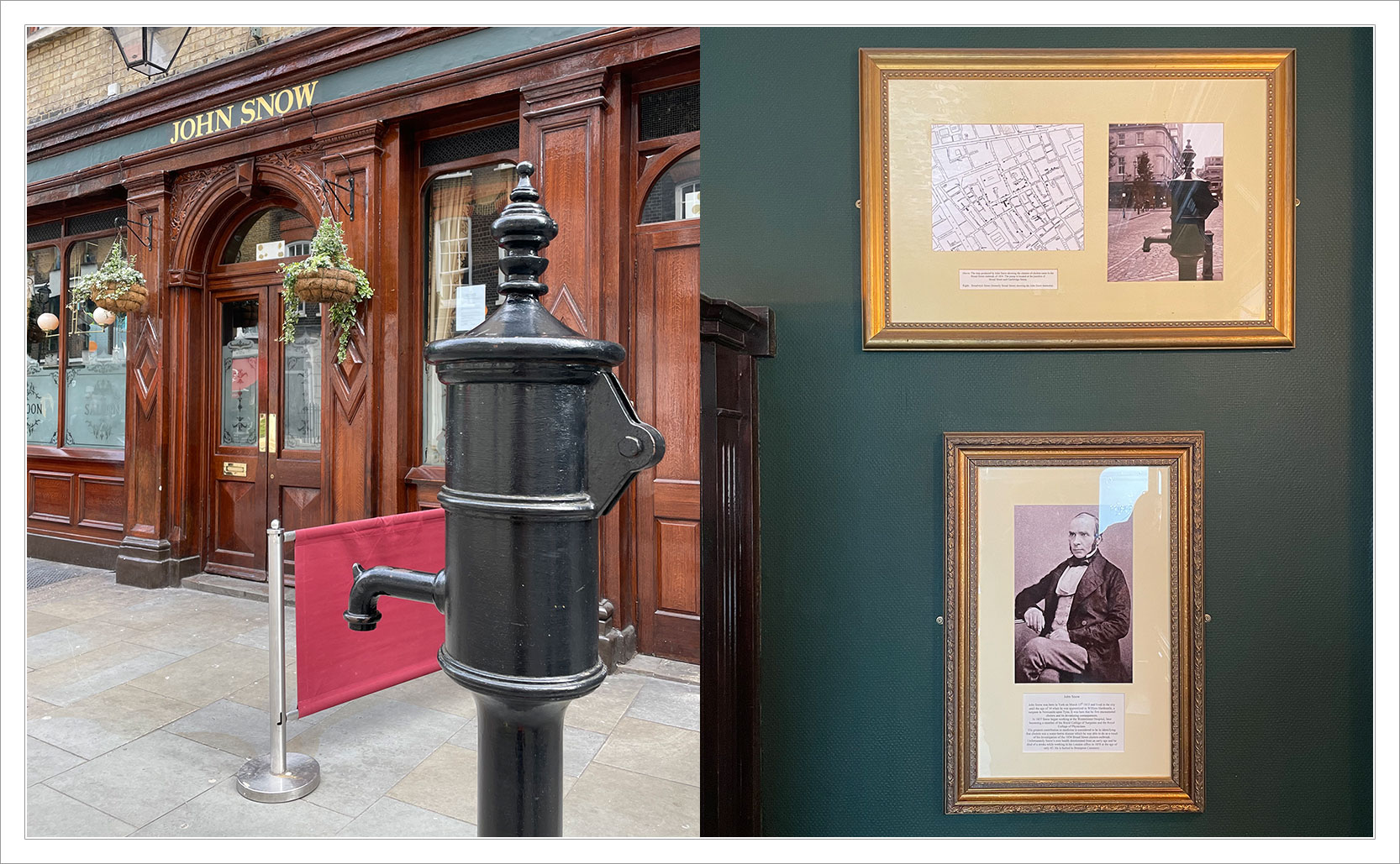
Added info: Today there is a replica of the water pump where the old one stood, but Broad Street is now called Broadwick Street. The pump sits just outside of the John Snow pub.


