Medieval inspired typefaces still found around Ireland as throwbacks to the past.
Gaelic type, also known as Irish type, or cló Gaelach in Irish, are typefaces inspired by the handwritten insular scripts of medieval Ireland. Insular scripts and insular art are works from Ireland and Great Britain (“insular” coming from the Latin “insula” meaning “island”). This medieval style spread from Ireland and Britain to Europe by way of Irish missionaries.
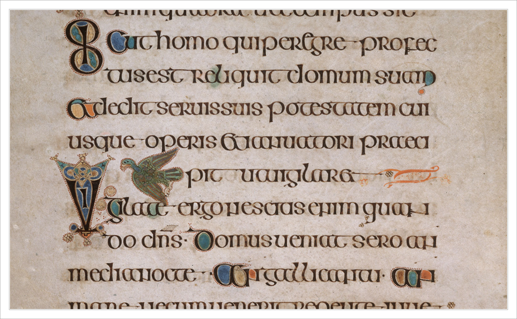
You can see both Insular scripts and insular art in the illuminated manuscripts of the time, with the 9th century Book of Kells being perhaps the most famous.
The Book of Kells is an excellent example of both insular script and insular art.Gaelic type was designed after medieval Irish insular script with a few letter forms be distinctly different from their Roman counterparts.
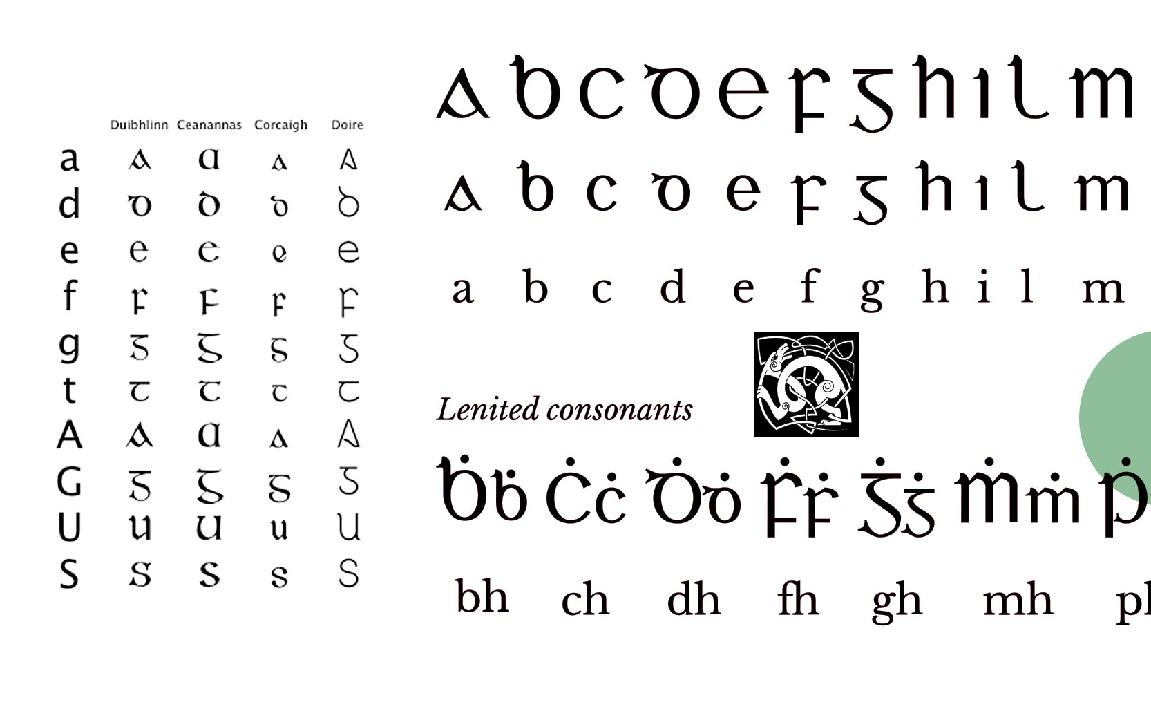
Insular script to Gaelic type
Invented in 7th century Ireland, insular scripts’ predecessors were uncial script (an all capitals style of writing) and half-uncial (a mix of capitals and lower case letter forms). What set insular apart was that its rounded letter bows were often very wide & circular, while its ascenders ended in triangular shapes. The letters “G” “D” and “T” are also markedly different from their Roman counterparts.
By the 16th century typefaces were created of the insular script styles. In 1571 the first Gaelic typeface was used for the text of a catechism, commissioned by Queen Elizabeth I, in an attempt to convert Irish Catholics to Anglicanism.
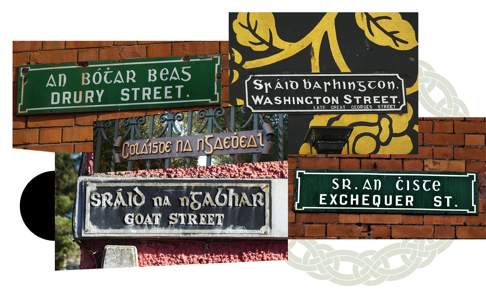
Gaelic type was in regular usage well into the 20th century. Today you can still find it in street signage, pubs, packaging, and more.
Middle ages to the middle of the 20th century
Long after most countries had moved on to Roman style typefaces, Ireland continued to use Gaelic typefaces into the 20th century. The use of Gaelic type helped reinforce the country’s unique culture and served as a subtle form of protest against the British. Bilingual street signs feature Gaelic type for the Irish name and a modern font for the English name. In Dublin the CLÓSCAPE Research Project looks to document, and hopefully preserve, these bilingual signs.
Today you can still find some bilingual signs around Ireland that feature Gaelic type. Product packaging, advertising, pub signage, and logos continue to use Gaelic type as a nod to the past with an appreciation of Irish culture.
The Roman emperor Trajan’s military victories led to a triumphal column in his honor. The typography of the column led to a font also named in his honor.
Born in 53 CE in the modern day province of Seville Spain, Trajan was the second Roman emperor from the Nerva–Antonine dynasty (which produced the “Five Good Emperors” – including himself). His experience as a Roman general, senator, and governor of upper Germany helped him become emperor Nerva’s choice as his successor.
During his 19 year reign Trajan expanded the Roman Empire to its greatest size to date. As part of this expansion he took the kingdom of Dacia (roughly modern day Romania). One motivation for the conquest was that the Dacian kingdom, unlike other Germanic tribes, was sufficiently organized enough to make alliances with other nations, making it a threat to the Romans. Another motivation was money. After the conquest the Romans took control of the gold and salt mines of Dacia, using the proceeds to pay for public works projects back in Rome.
To celebrate this lucrative victory over Dacia the Roman Senate had a column constructed in Trajan’s honor, which leads to …
Trajan’s victory over the Dacians was commemorated / propagandized with Trajan’s Column.
Trajan’s Column
Completed during Trajan’s lifetime in 113 CE, Trajan’s Column is a 98 foot tall marble column that commemorates / propagandizes Rome’s victory in the Dacian Wars. With an estimated total weight of over 1,000 tons it’s an impressive feat of artistry and engineering. As it spirals upwards it features 2,662 figures (Trajan being 58 of them) and 155 scenes in relief that tell the story of the conquest. National Geographic has an interactive graphic that does an incredible job guiding you up the column but plaster cast recreations of the relief exist in several museums around the world as well.
The column is also a tower – there is a circular staircase inside that takes you to the top. The top of the column used to (logically) have a statue of Trajan, but the statue went missing sometime in the Middle Ages and today St. Peter stands atop the tower.
The column / tower is also a tomb. After Trajan died in 117 CE his ashes were buried in a chamber at the base of the column. The ashes of Trajan’s wife Plotina were added a few years later. On the exterior of the base above the doorway to the burial chamber is an inscription to Trajan. More interesting that what the inscription says is how it says it. The beautiful letter forms of the typography became inspiration for letter artists and designers, which leads to …
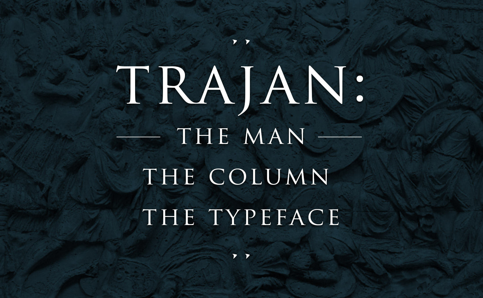
The letterforms on Trajan’s Column inspired the font Trajan.
Trajan the Typeface
Trajan the typeface was created in 1989 by Carol Twombly for Adobe. She used the very old lettering on Trajan’s column as inspiration for a very new typeface. The letter forms found on Trajan’s column are known as Roman square capitals which are the basis for our uppercase letters. Roman square capital letters were used primarily for engravings and can be found around ancient Roman sites (the Pantheon, the Arch of Titus, etc).
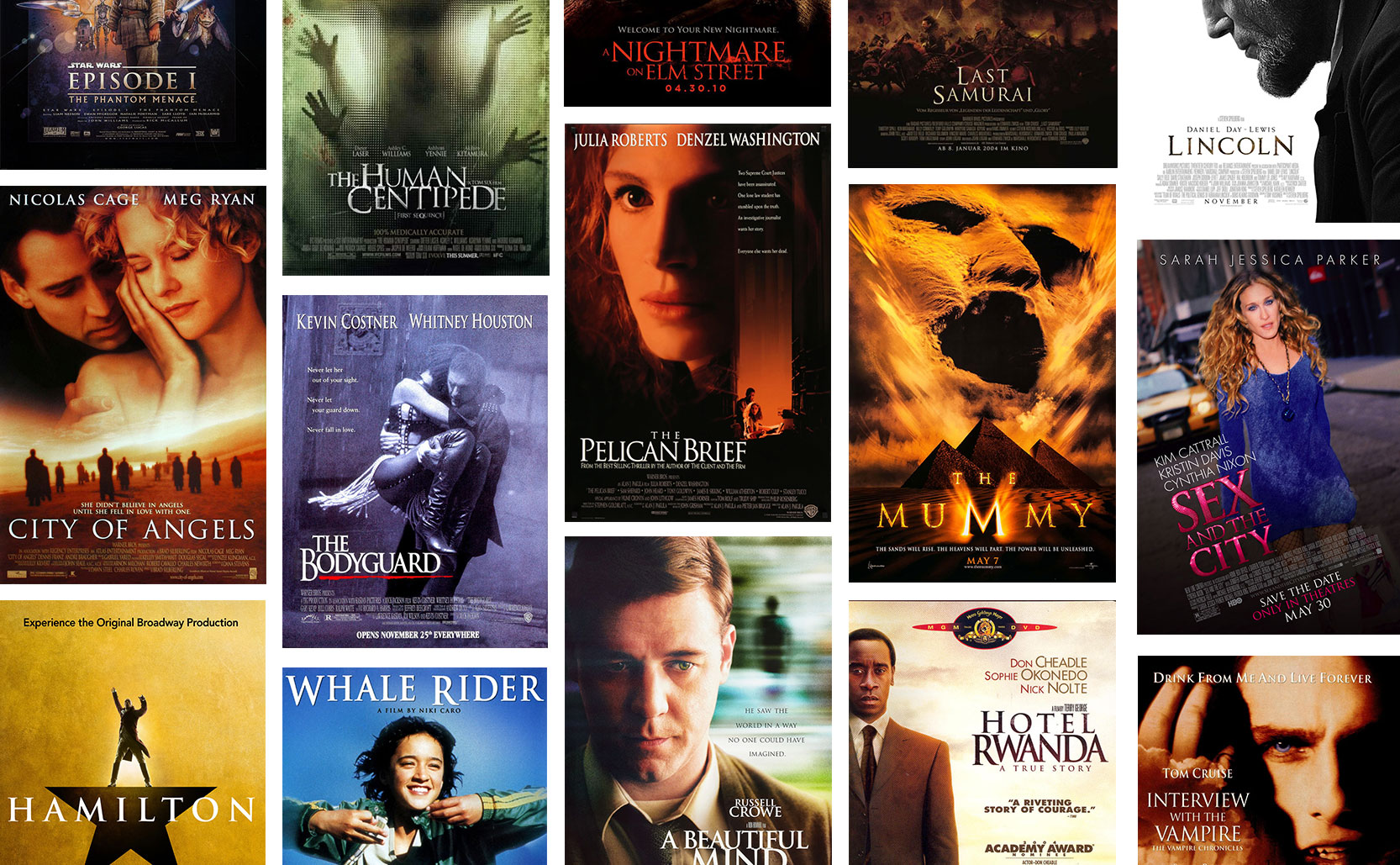
Starting in the early 1990s, Trajan has appeared on many many movie posters.
From its debut in 1989 Trajan quickly became a very popular typeface and particularly for movies. Its first movie poster appearance was 1991’s At Play in the Fields of the Lord. In the early ‘90s it was thee typeface for dramatic films but spread to appearing across genres. Eventually the movie poster/packaging market was so saturated with Trajan that more serious films began to use other typefaces and so Trajan shifted to only really appearing in horror movies, B-movies, and straight-to-video movies. Trajan’s elegant letter forms were being employed to add gravitas to movies that might not be so great.
In less than a decade (less time than Trajan the man ruled the Roman Empire) Trajan the typeface rose and fell in popularity. You still see it from time to time – some new movies use Trajan, some politicians use it much like politicians did a few thousand years ago – but Trajan no longer rules like it once did in the 90s or the 1990s.
A tour to the top of Trajan’s Column.
Learn more about Trajan’s rise & fall of being the serious movie typeface.
The style of common American house numbers was influenced by Chinese design.
There is a fairly ubiquitous design style to the address numbers on American houses. While there are some variations to the design it’s essentially a brush script typeface.
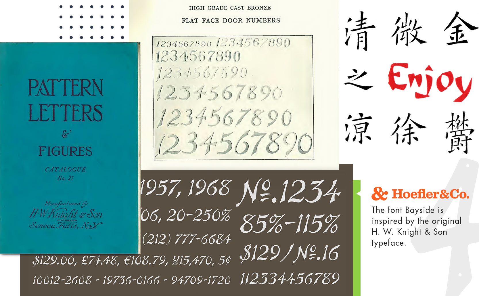
The earliest example of this typeface is the 1927 H. W. Knight & Son catalog of letters & numbers, a catalog of physical type to be used in signage, monuments, headstones, etc. Described as simply “Door Numbers” with no comment on the design, the catalog offers two different styles of numbers with the other being more of a traditional serif typeface. It’s the brush script set of numbers though that we see most frequently, but why?
A collection of houses with variations of the typeface found in the Knight & Son catalog.
Chinoiserie
From the late 17th through the 18th century there was a European fascination with things from the East and in particular China. Europeans emulated the Chinese decorative style and incorporated it into their own work. The Willow pattern for example is reminiscent of Qing dynasty but was created in England.
“Chinoiserie” is essentially French for “Chinese style” and came to encapsulate this orientalist movement of European produced creations designed in a (sometimes loose interpretation of) Chinese style. In the 19th century there was a Chinoiserie revival which lasted into the 1920s. The Art Deco movement was strongly influenced by designs from China (just look at Grauman’s Chinese Theatre). Which brings us back to H. W. Knight & Son in 1927.
Some examples of Chinoiserie and how the Chinese design style influenced the Rococo style of the 18th century.The Chinoiserie revival of the 19th century extended into the Art Deco of the 1920s.
The design of the H.W. Knight house numbers was influenced by the Art Deco Chinoiserie style of the day. Looking at traditional Chinese calligraphy as well as more modern Chinese inspired fonts it’s easy to draw a connection between these house numbers and Chinese designs. In 2006 Hoefler&Co. created the font Bayside which is a new font inspired by the H. W. Knight & Son typeface.
Drawing on the script numbers from the the 1927 H. W. Knight & Son catalog, Hoefler&Co. created the font Bayside.
The terms we use for different letterforms come from how they were stored.
In the beginning, there were capital letters (majuscule letters). The written languages of the Ancient Greeks and Romans were both in all caps. The Roman square capitals and the Roman calligraphic script eventually generated Uncial script. Uncial was used between the 4th and 8th centuries and continued the style of all caps. Around the late 8th century however, the Benedictine monks of Corbie Abbey in France began using a new style of writing which became the Carolingian script. Carolingian could be written faster than Uncial script because it used a new style of letters: lowercase (minuscule letters). What this meant was that some European countries now had two different styles for each letter of the alphabet. These different letterforms meant the same things, and were pronounced the same ways, but they looked different.
While these letterforms started off isolated to their respective styles of writing, over the centuries they began to commingle. This merger of letterforms was partially inspired by the decorative initial caps in illuminated manuscripts. It wasn’t until the 14th century that grammatical rules began to define when to use a majuscule letterform in otherwise minuscule text (such as capitalizing the start of a sentence, or someone’s name, etc).
Uncial script on the left (a portion taken from The Book of Kells) compared to Carolingian script on the right.
Majuscule minuscule, uppercase lowercase
Johannes Gutenberg introduced the printing press to Europe in 1439. The printing press allowed individual metal letters to be assembled together to print information. All of these metal letters were organized into trays/drawers/cases. The majuscule letters were used less often and so were placed higher up. The minuscule letters were used the most and were placed the closest to the worker setting the type. Because of their position these higher elevated majuscule letters became known as “uppercase” while the easier to reach minuscule letters became “lowercase.”
A 20th century type drawer/case.
An explanation of uppercase and lowercase letters and how these terms originated with the printing press.
Added bonus: Not all languages have uppercase and lowercase letters. Unicase languages include Arabic, Hebrew, and Georgian to name a few. That said, while Arabic doesn’t have the capitalization rules that Latin derived languages now have, Arabic does utilize the IMFI writing system. Based on the position of the letter in a word or sentence (initial, medial, final, or isolated), one of four different shapes are used. So instead of the two letter form variations that the Roman alphabet has Arabic has four but for different reasons.