Irish “Pub In A Box”
As part of a Guinness marketing effort in the early 1990s, thousands of Irish pubs around the world have been built using standardized design templates.
Recognized around the world, the Irish pub is one of the most well-known Irish cultural exports – and where there’s an Irish pub there’s usually Guinness. In the 1980s Guinness began to track the causal relationship between new Irish pubs and regional increases in Guinness beer sales. As new pubs opened, Guinness sales went up. If Guinness could help create more Irish pubs then they could also increase their own revenue.
Ahead of the 1990 World Cup in Italy, Guinness sales representatives traveled around Italy meeting with potential Italian business partners with the goal of opening Irish pubs. Their pitch was built around revenue generation and how Irish pubs have a more profitable beverage-to-food ratio than most other bars. From January to June of 1990 Italy opened 58 Irish pubs, welcoming Irish soccer fans and drinkers of all kinds. However, the critical factor to revenue generation was that these pubs needed to appear authentic – enter the “pub in a box”.
Pub in a Box
Successful Irish pubs outside of Ireland have the look & feel of the real thing. As part of their expansion effort Guinness assembled a team to analyze, quantify, & document the seemingly ineffable essence of the Irish pub. The Irish Pub Concept helped determine the critical success factors to operating an Irish pub. Chief among these factors is visual authenticity.
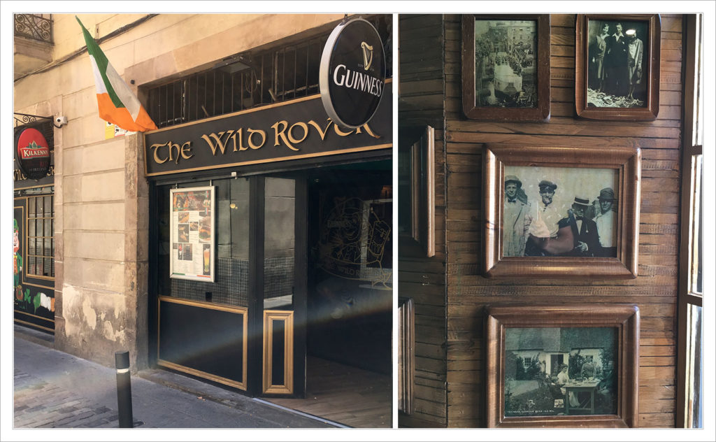
Founded in 1990, the Irish Pub Company of Dublin was one of the first companies to offer “authentic” Irish pubs for export. Instead of doing all of the work yourself they’ll take your dimensions and design, manufacture, and ship all of the necessary materials to you. Do you want the rural Irish pub style or the Victorian? Maybe you want the general “Celtic” style. They offer a variety of prepackaged pub types that come complete with all the knickknacks for the walls. To date they have designed & shipped over 2,000 pubs to more than 50 countries.
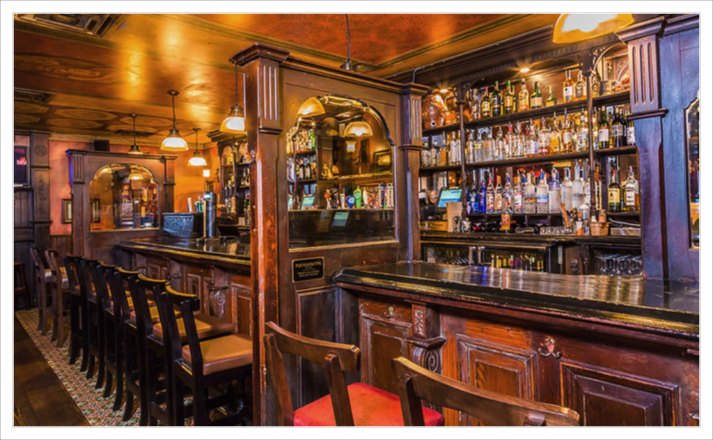
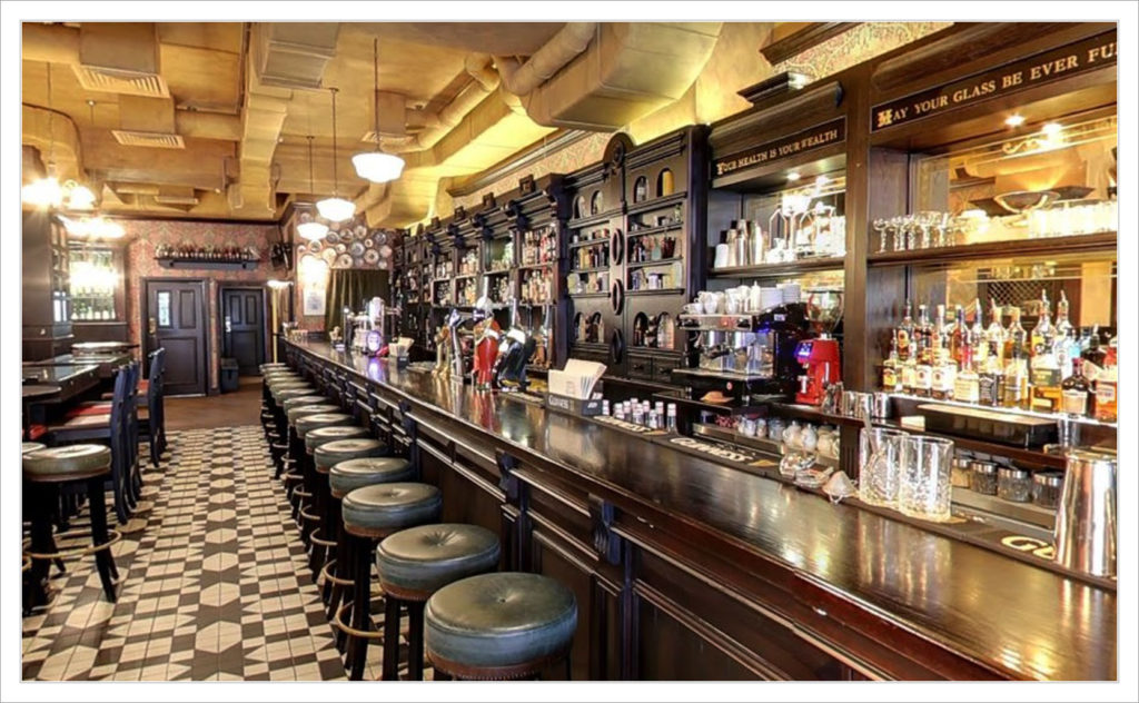
The Irish Pub Co. isn’t alone. Ól Irish Pubs and GGD Global also offer to design & ship you a “pub in a box”. This Disney-ized packaging of Irish culture is not without criticism. For one it raises questions of authenticity. It’s true these are pubs that have been designed & manufactured in Ireland. However, it’s difficult to claim authenticity when your pub has a fake Irish country store as part of the decor. Instead of organically collecting meaningful mementos for your bar, these superficial design packages ship all the rusty farm equipment, dusty old bottles, and framed photos of strangers you need to give the illusion of authenticity. Why take years cultivating a unique local flavor when you can just throw up a portrait of Michael Collins or the Molly Maguires?
An additional criticism is of Guinness for helping to bring these “pub in a box” bars into existence. Established Irish bars were expected to keep serving Guinness beer while the Guinness company was busy creating additional local competition. Beginning in the early ‘90s some bars boycotted and stopped serving Guinness. McGillin’s Olde Ale House of Philadelphia still does not serve Guinness as a result of the “pub in a box” fallout with Guinness.
Better than nothing
To many customers the ambiance that these cookie-cutter bars generate is all that matters – the question of authenticity never crosses their minds. The theatrical set dressing used by these bars creates a fun environment. Even for those who recognize the dubious credibility of these establishments, some feel to have a “pub in a box” Irish bar is better than having none at all.
As America has helped transform St. Patrick’s Day into an all-out extravaganza, Irish pubs (authentic or otherwise) are increasingly patronized not only by the diaspora but by people of all backgrounds. The pub offers people of all stripes an environment that is hard to find anywhere else. The long tradition of the pub serving as a gathering place for the local community can still be carried out by these “pub in a box” bars … just don’t scrutinize the bric-à-brac too closely.
Added info: If you’re interested in standardized / templated restaurant experiences, you may also be interested in learning about how the Thai government’s culinary diplomacy has successfully spread Thai restaurants around the world.